Goldtoe Socks
Creative Direction, Graphic Design
Rebranding, Packaging
This project was designed as part of my employment with Gildan USA.
The PROJECT
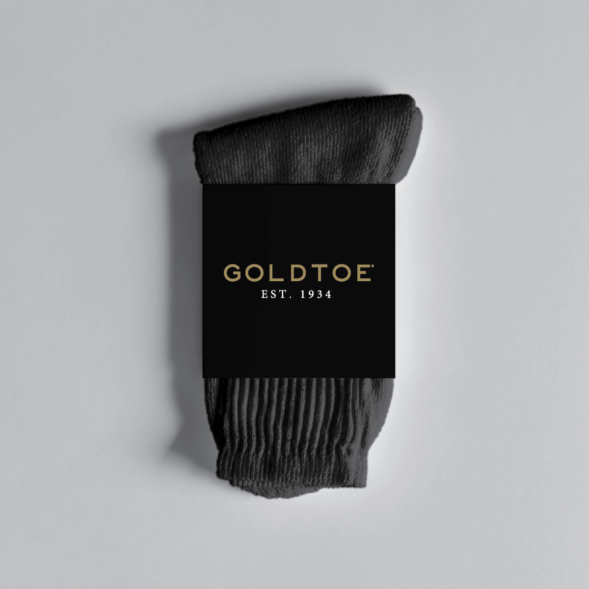
Founded in 1934, Gold Toe Socks is an iconic hosiery brand sold in stores and online retailers across the country. Once the go-to for working professionals, the brand recently struggled to stay relevant, especially with younger audiences. With such a large physical footprint, pulling and repackaging existing stock would cost the company millions of dollars, meaning that rebranded packaging had to look cohesive when hanging next to the existing displays. Tasked with refreshing the GoldToe image, my objective was to create new branding and packaging standards that would attract new buyers without alienating loyal customers, providing a cohesive look across all lines and collections while celebrating the brand’s history and quality.
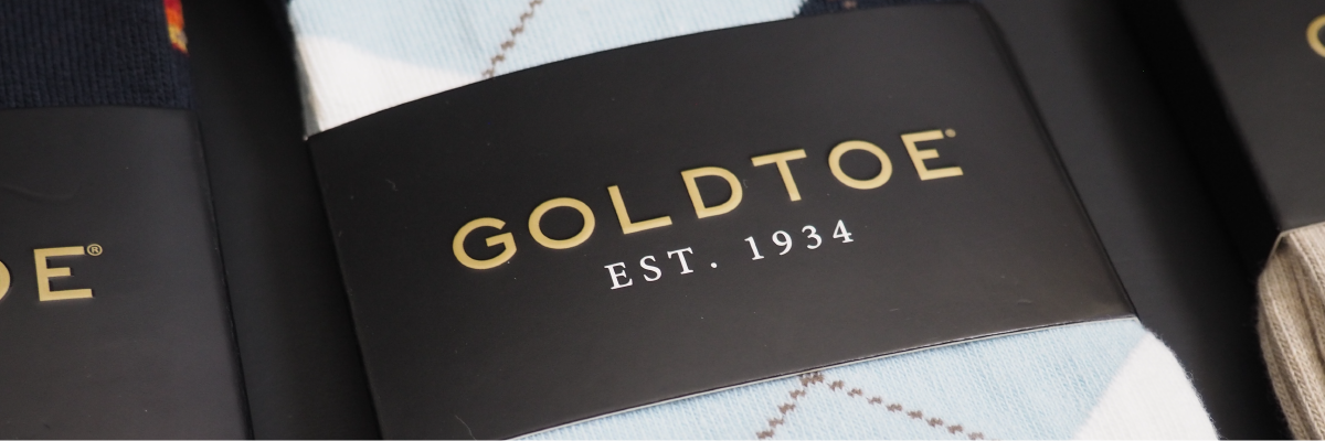
Before

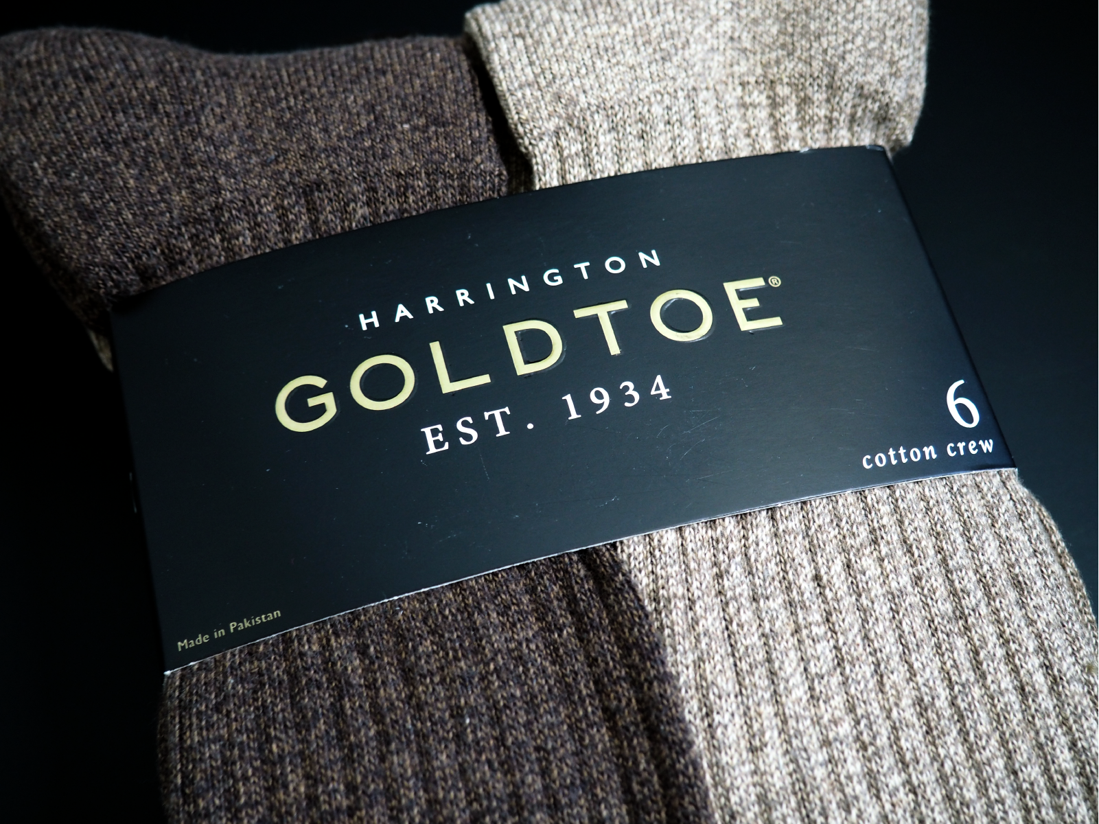
After
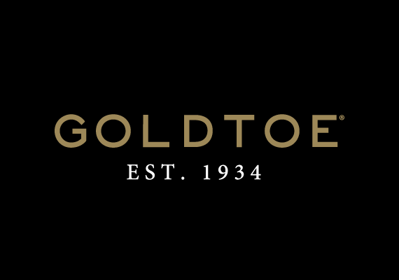
Subtle changes to logo structure, color palette, and typography created a modern take on the classic mark.
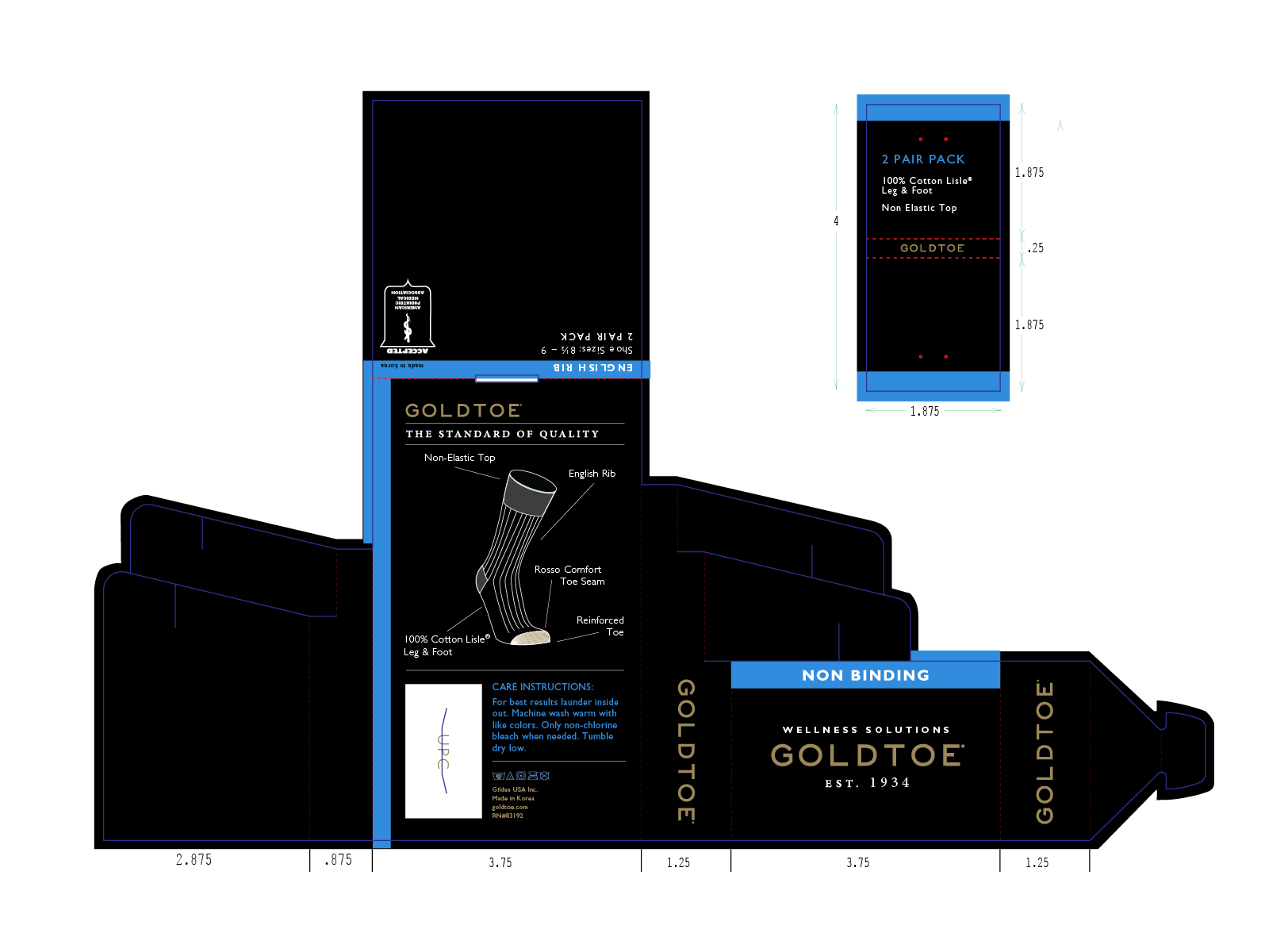
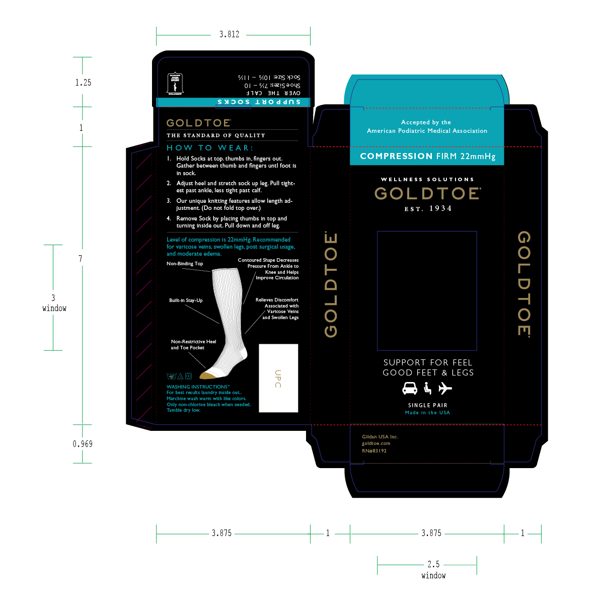
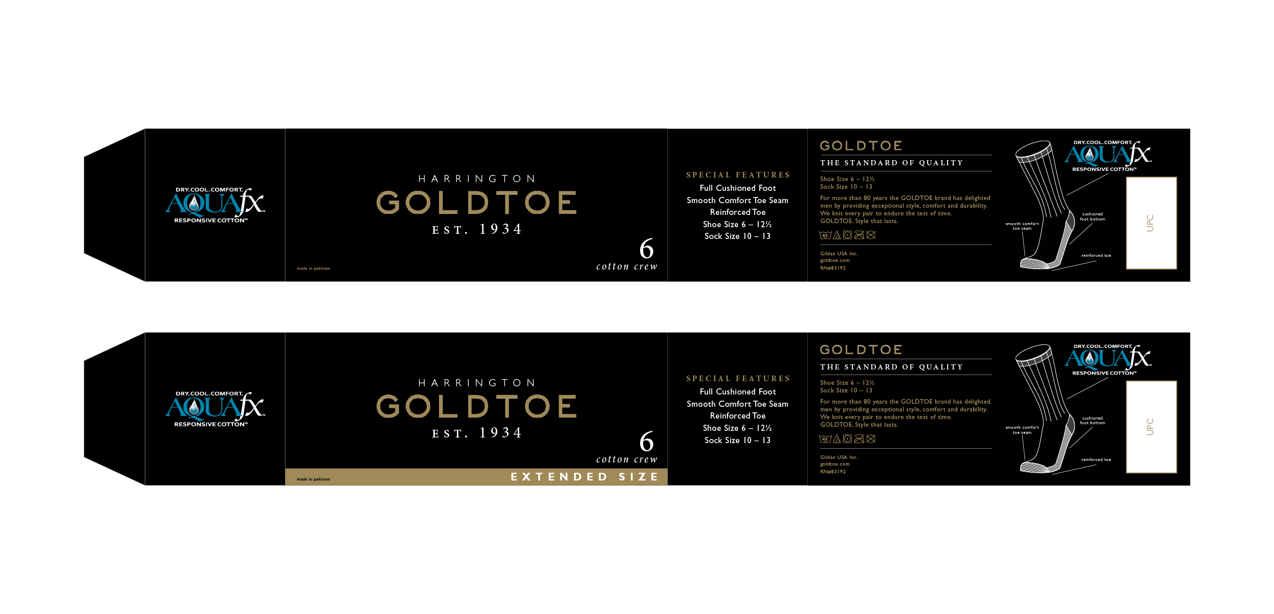
The STRATEGY
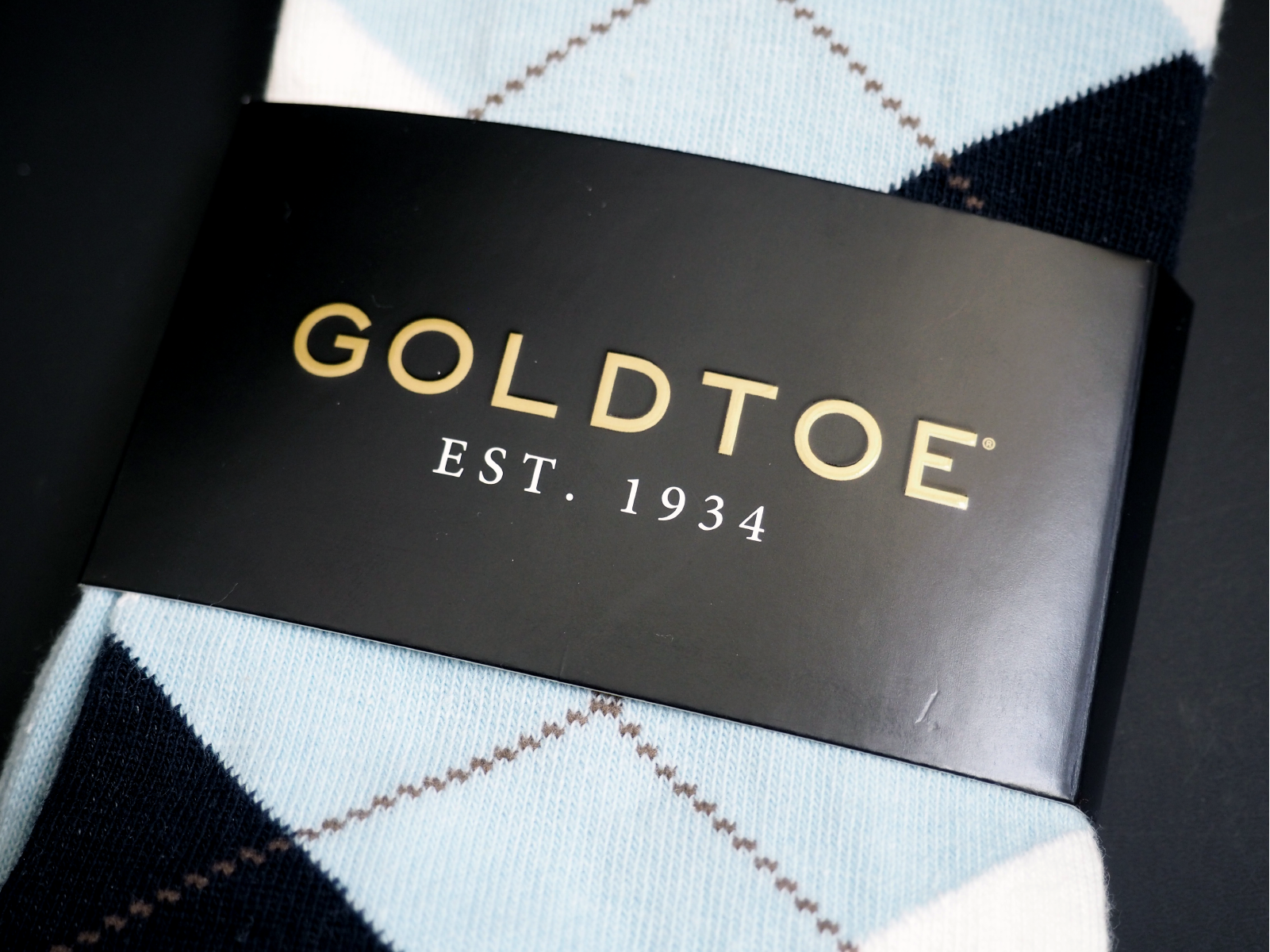
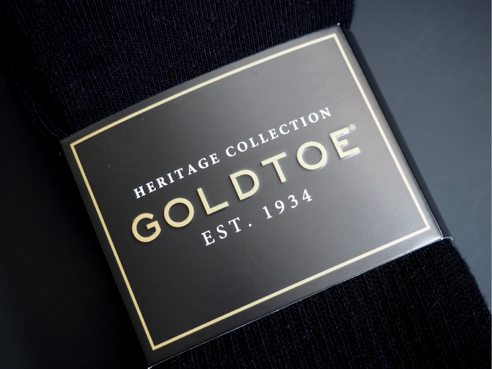
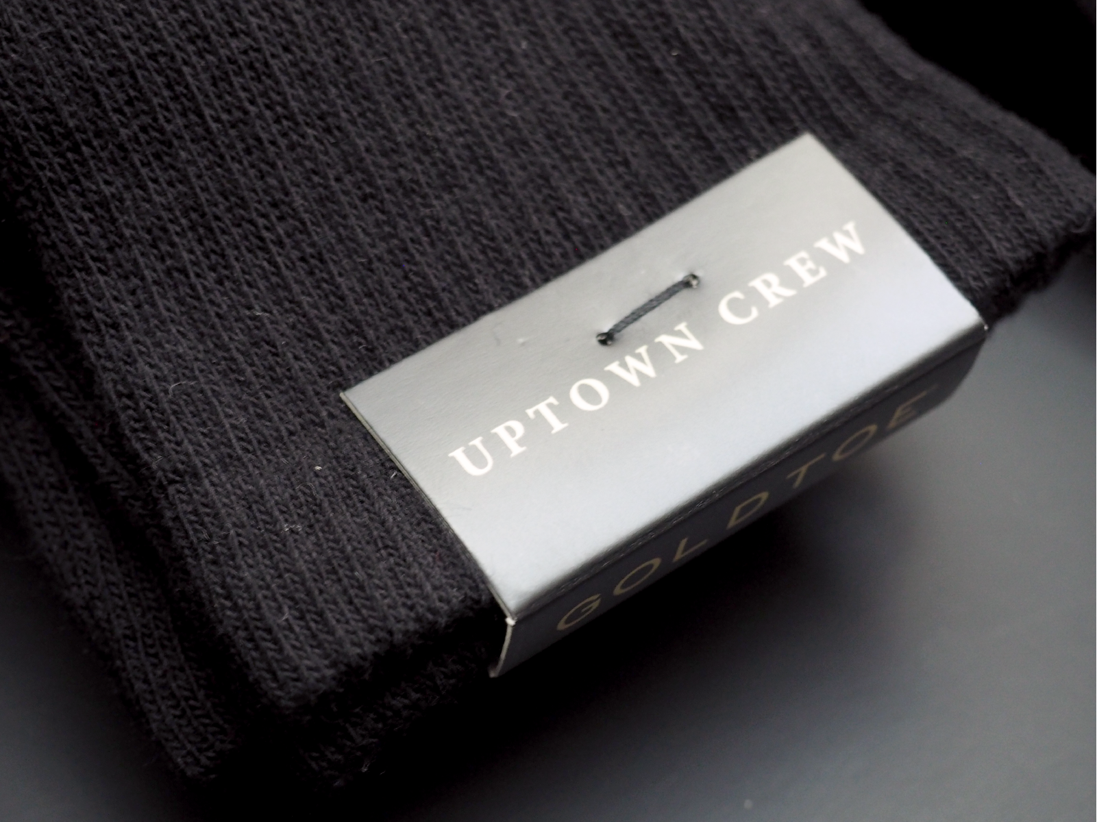
With multiple lines of socks, different collections within each line, and no visual cue to differentiate between products, it had become difficult for customers to understand which items they wanted to purchase. To solve this issue, each line and collection was given a unique identifier to allow shoppers to easily identify the product. Additionally, all products were packaged overseas and the structure of the existing packaging was flimsy, often tearing and popping open, leading to messy and disorganized in-store displays. All of these key considerations needed to be addressed with the new packaging designs. Since the launch of the new brand image and packaging, GoldToe has experienced a significant increase in sales, expanded into new stores like Target, and gained a significant following on social media.